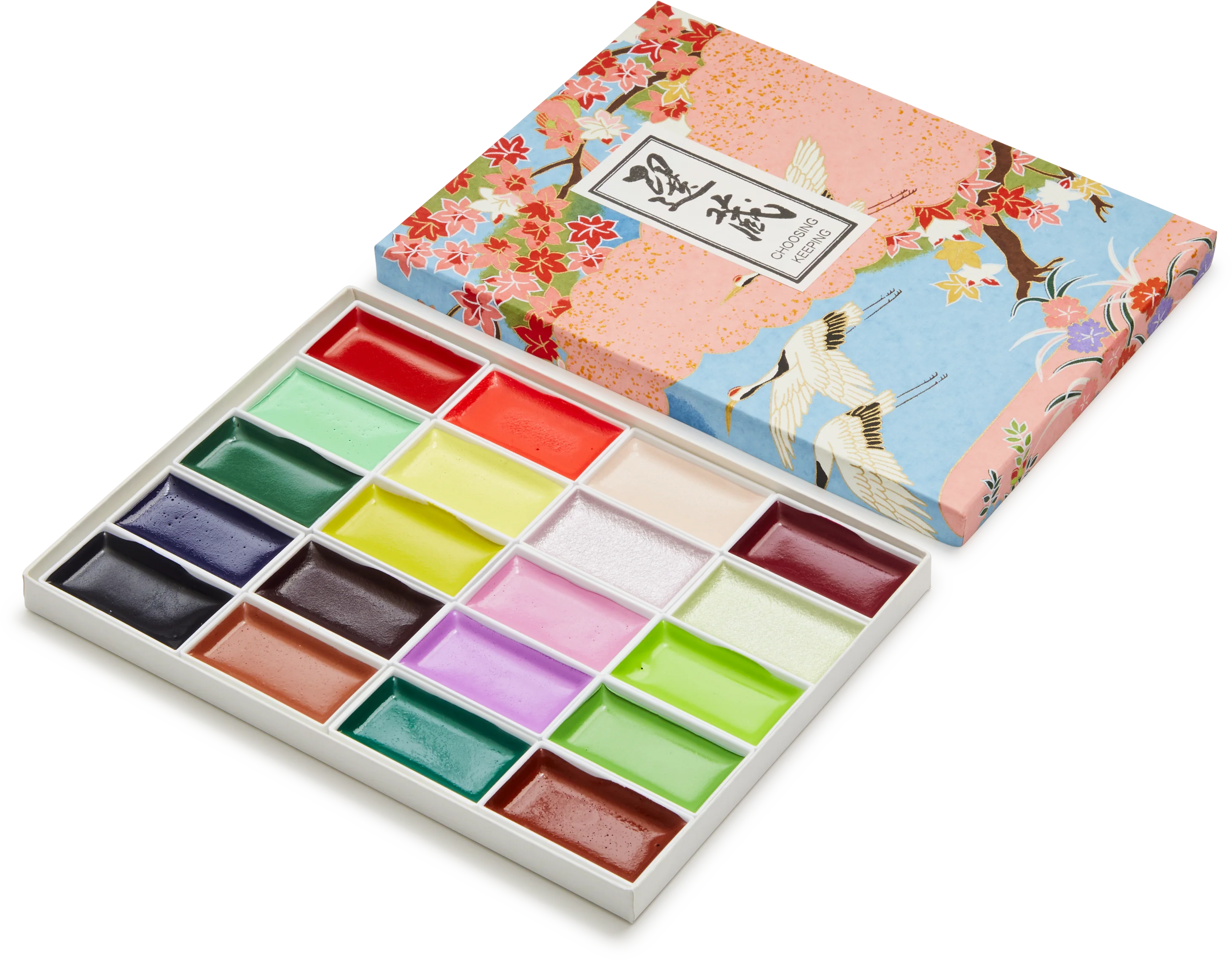
Japanese Seasons Watercolour Set, Spring
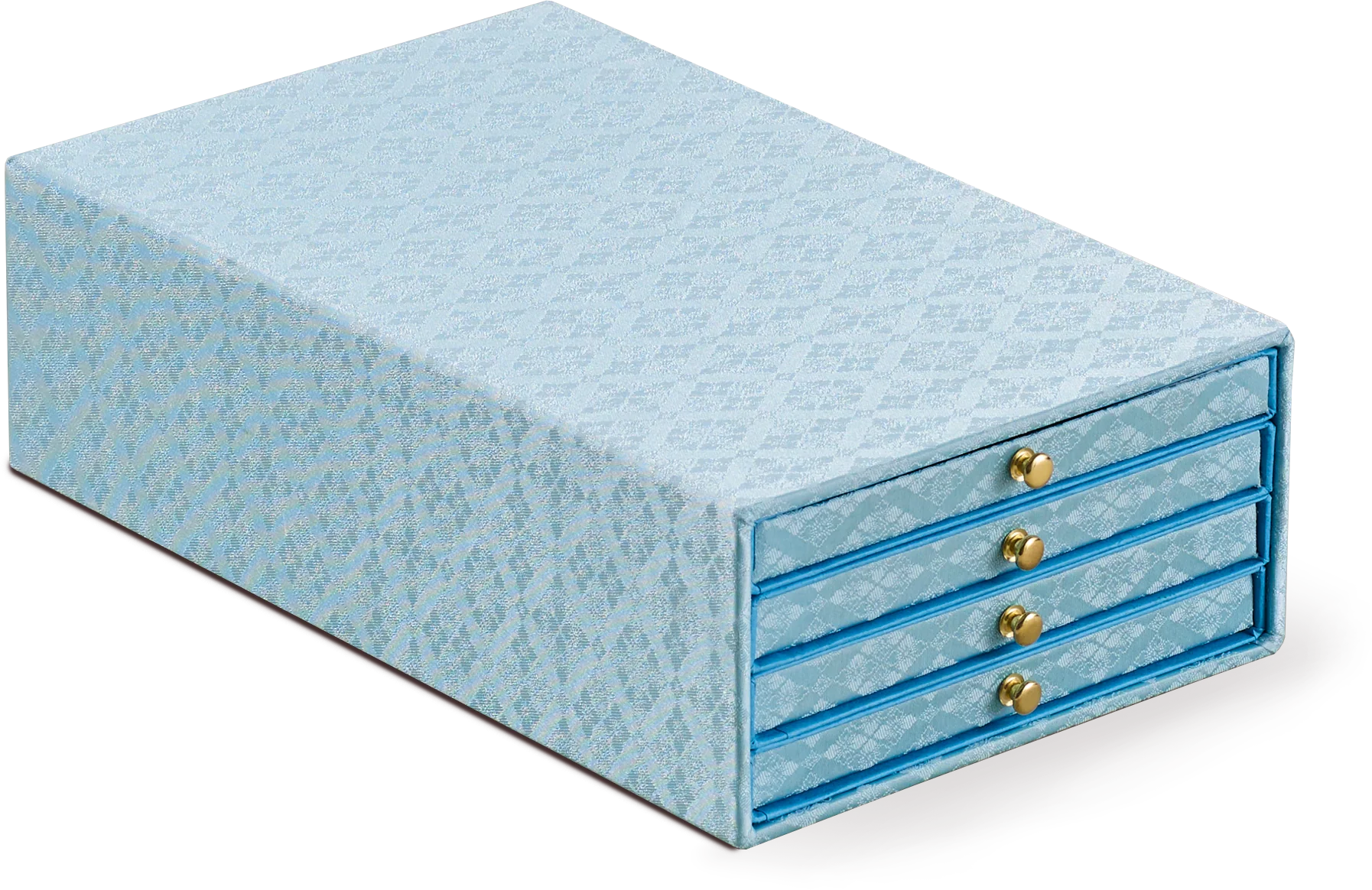
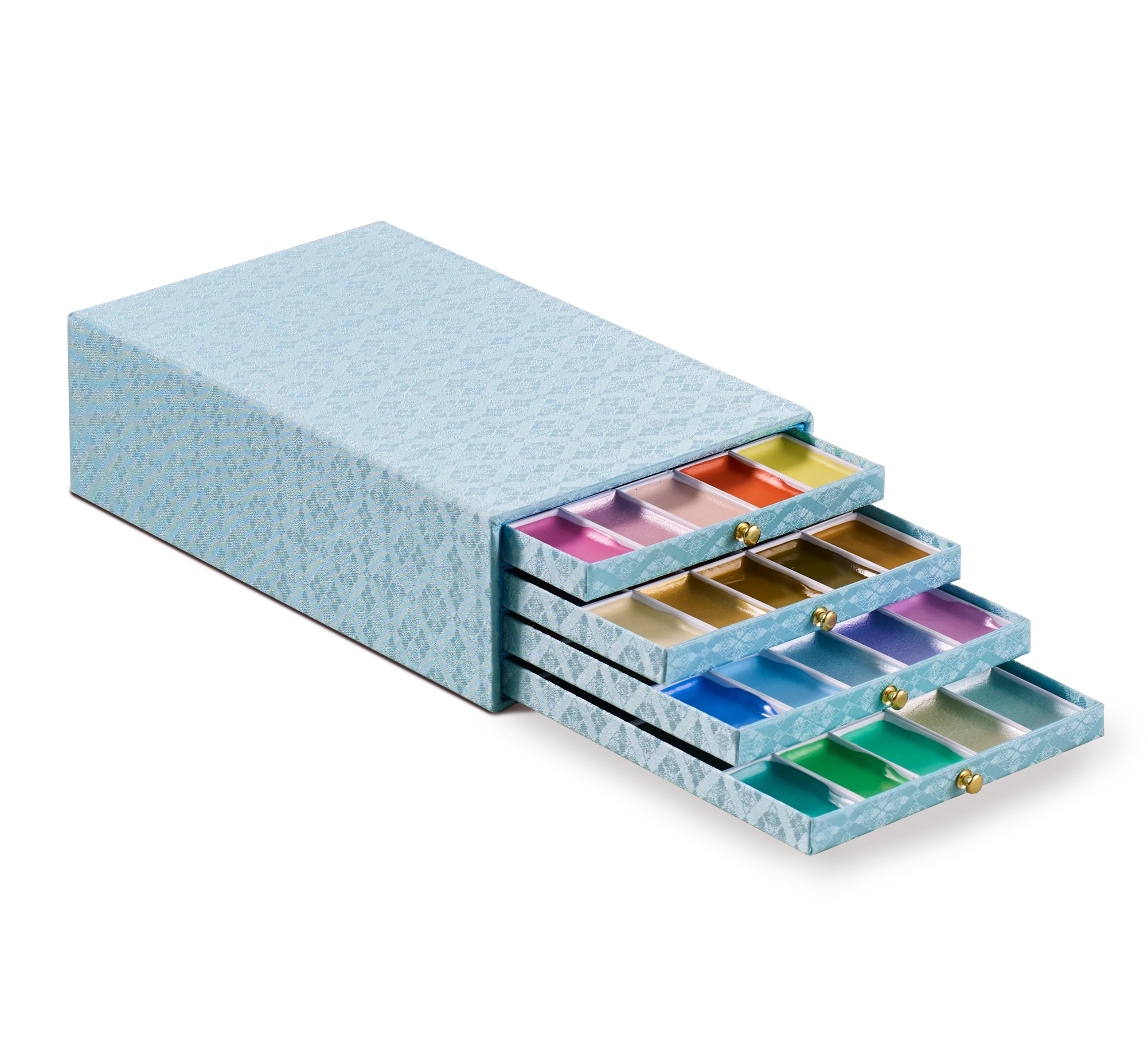
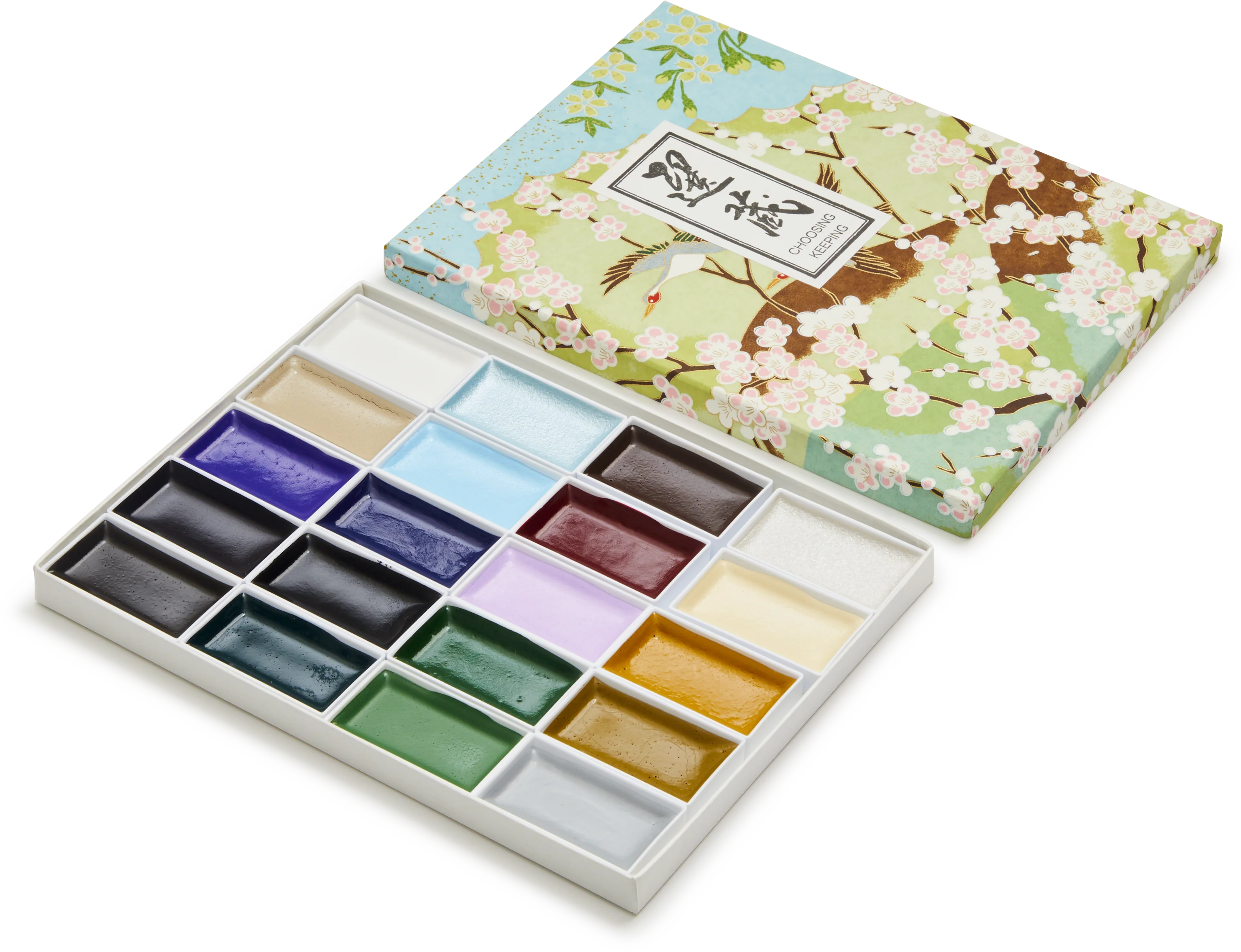
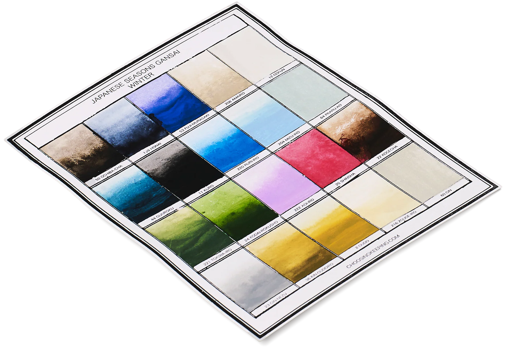
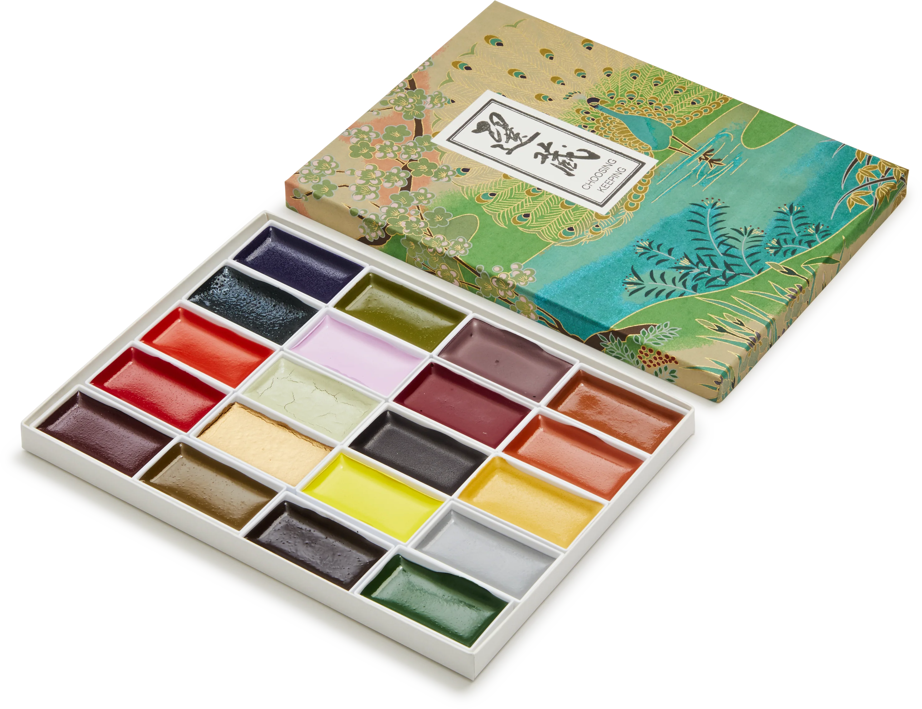
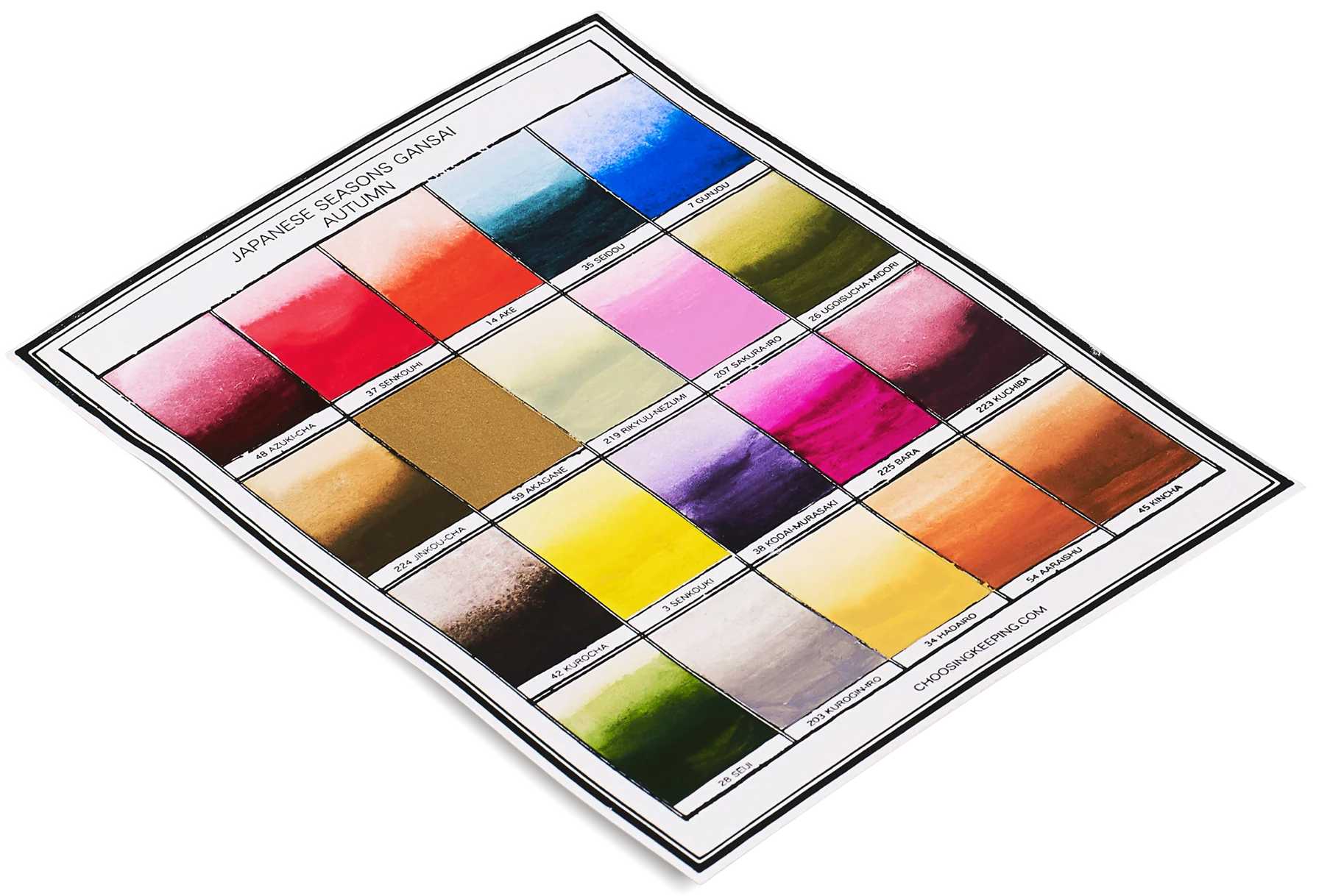
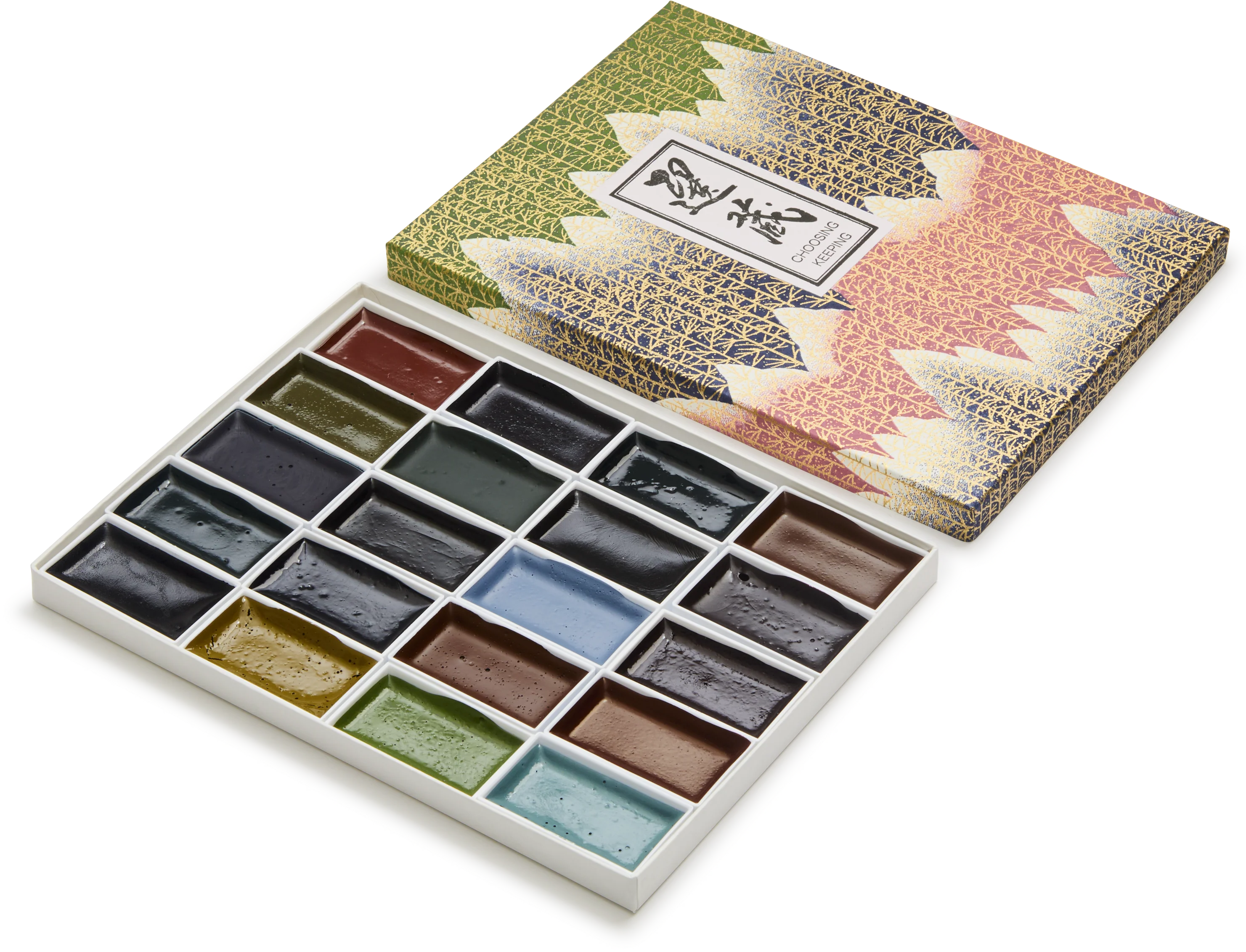
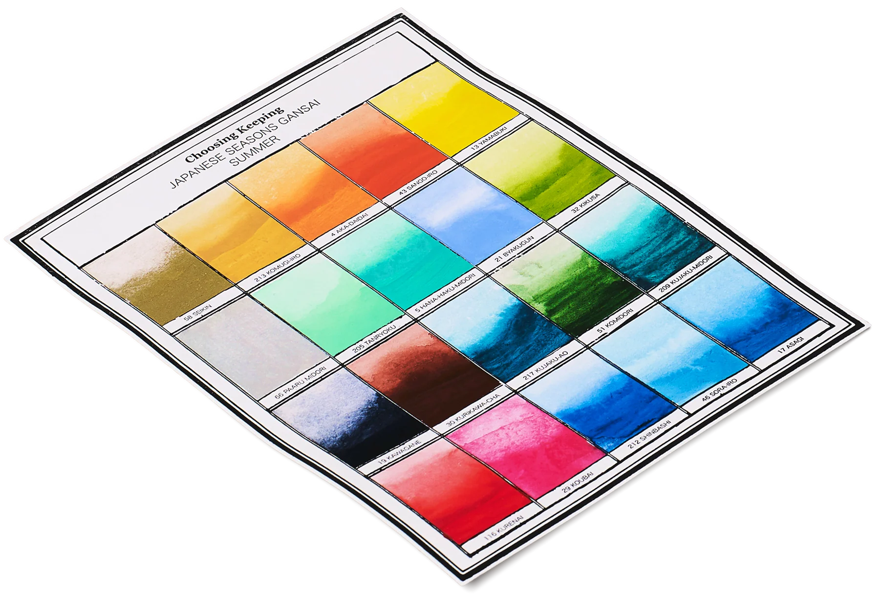
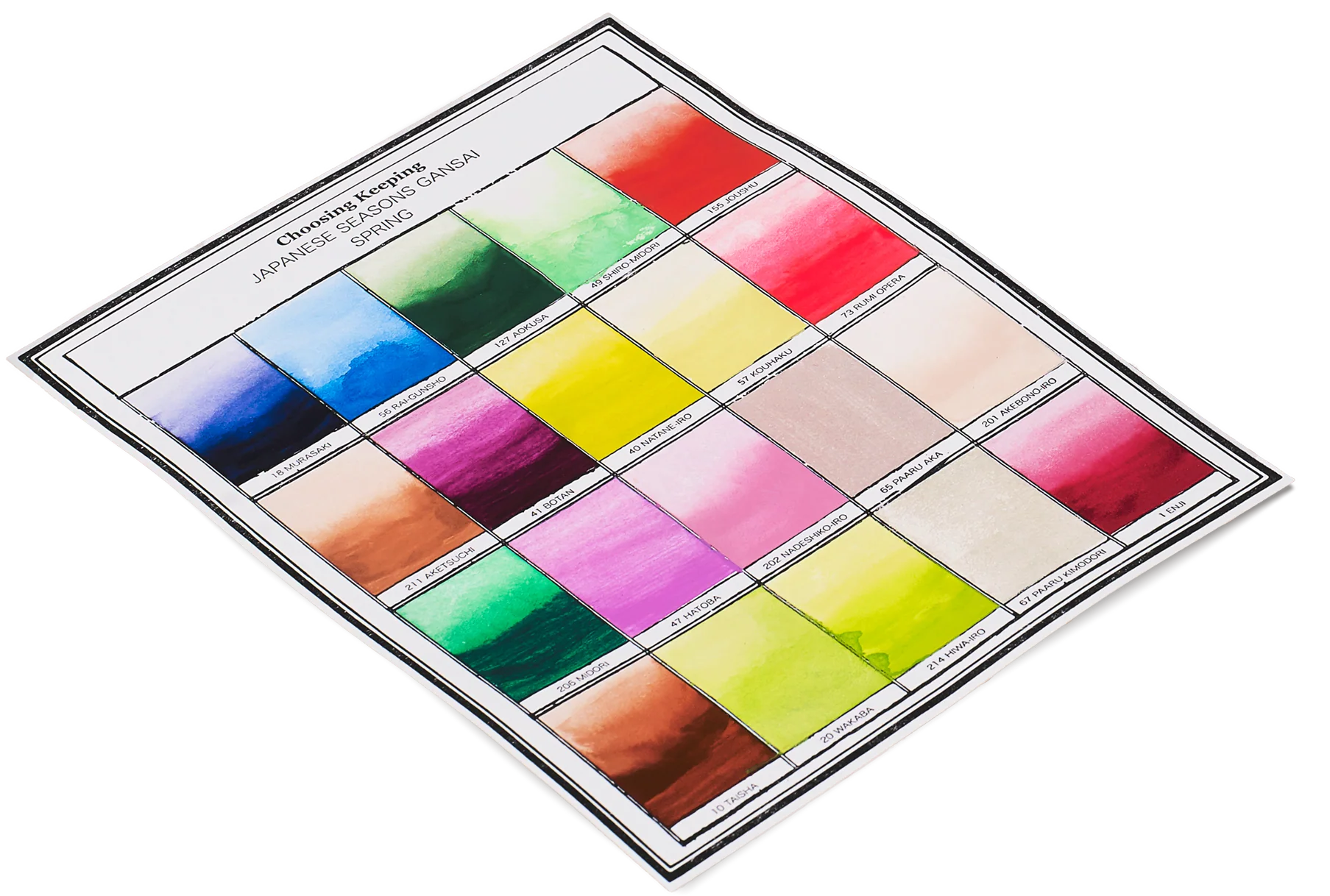
Gansai paints are made in Japan using a colour palette specific to Kyoto, Japan’s imperial capital during the high middle ages, and codified in a colour dictionary pointing to precise references in nature. Choosing Keeping’s Spring paint set borrows from this chromatic lexicon - the bright green tones of Wakaba or fresh leaves, purple from wisteria, and of course pink from, Sakura (cherry blossom), which is a key Shinto symbol of spring. How romantic that Japanese colour nomenclature don’t pertain to chemistry - but rather references subjective emotions and fleeting observations of nature. For example, Akebono-iro - the palest light pink refers to ‘daybreak colour’ or Hatoba which can be translated as ‘pigeon wing’. If you consider that each colour is so well considered, Gansai paints are not intended, at least in theory, for mixing. Compared to the Western style half pans (think Winsor and Newton), they are presented in large and wide full sized pans, designed to be used straight out the palette, ready to accommodate a generous paintbrush without splitting any bristles. Gansai’s particular strength is its versatility - either opaque, thick and creamy for a texture reminiscent of gouache - even pale and light colours can be laid over dark papers with obvious contrast similar to dry pastels. Add water and the paints resemble Western style watercolours - more give, more luminescence and transparency.
Product Information
Product Information
Shipping & Returns
Shipping & Returns
Description
Gansai paints are made in Japan using a colour palette specific to Kyoto, Japan’s imperial capital during the high middle ages, and codified in a colour dictionary pointing to precise references in nature. Choosing Keeping’s Spring paint set borrows from this chromatic lexicon - the bright green tones of Wakaba or fresh leaves, purple from wisteria, and of course pink from, Sakura (cherry blossom), which is a key Shinto symbol of spring. How romantic that Japanese colour nomenclature don’t pertain to chemistry - but rather references subjective emotions and fleeting observations of nature. For example, Akebono-iro - the palest light pink refers to ‘daybreak colour’ or Hatoba which can be translated as ‘pigeon wing’. If you consider that each colour is so well considered, Gansai paints are not intended, at least in theory, for mixing. Compared to the Western style half pans (think Winsor and Newton), they are presented in large and wide full sized pans, designed to be used straight out the palette, ready to accommodate a generous paintbrush without splitting any bristles. Gansai’s particular strength is its versatility - either opaque, thick and creamy for a texture reminiscent of gouache - even pale and light colours can be laid over dark papers with obvious contrast similar to dry pastels. Add water and the paints resemble Western style watercolours - more give, more luminescence and transparency.